Body 1 – General Content
Body 1 – General Content
Description
This versatile section has a number of nested sections. It has a general content section with a WYSIWIG editor. It can include accordions, tabs and images. It also has an optional sidebar with a list section, a text section, and a block section. Choose left or right sidebar orientation.
Please note sidebars are specific to a given page. There is no global sidebar.
Fields and Character Limits
*required fields
Content*
Help Text: Make sure content in this field follows guidelines and best practices for content creation, including headers, web writing and accessibility and more.
Additional Sections and Sidebar for Body 1
Additional Content Sections:
- General Content Area – Add a new general content area after you have added an image, divider, accordion or tab in the Body 1 content section.
- Image – Body 1 – Add images between content sections. See Images 1 – Basic Image for info and how to use.
- Divider – Body 1 – Add dividers between content sections. See Body 10 – Divider for info and how to use.
- Accordions – Body 1 – Add accordions between content sections. See Body 12 – Accordion for info and how to use.
- Tabs – Body 1 – Add tabbed content between content sections
Available Style Options
Content Section Orientation
- Left
- Right
- Center
Sidebar Orientation
- Left
- Right
- Sidebar Orientation on Mobile
- Top
- Bottom
Image Aspect Ratio
- Cinemascope 21:9
- HD Video 16:9
- Landscape 7:5
- Portrait 5:7
- Square 1:1
Image Caption Size
- 100%
- 50%
Image Caption Orientation
- Left
- Right
- Bottom
Where Can You Use This Section?
The section is available in the following templates and content types:
Templates
- About
- Basic Content
- Basic + Content
- Contact
- List
- Marketing
- News
- Start
Content types
- Content Page
- Landing Page
Using on a cloneable Template
- Locate Body 1 – General Content in the Body area
- Select Edit
- Select Edit to expand the General Content Area and replace the placeholder text.
- Remove or add any Sidebar Items you'd like
- Select Save at the bottom left of the page
Adding to a new Content or Landing Page
- In the Body area select Add Body Section
- Select Body 1 – General Content
- Select Add
- Enter your content in the General Content Area
- Select the Add Section to add any of the following Sections to Body 1 – General Content:
- General content Area
- Image – Body 1
- Add an image select the Browse button to upload from your computer, or select the link Open File Browser to find a previously uploaded image
- Enter the Alternative text
- Enter a Caption if desired
- Divider – Body 1
- Select the Divider Type and Width
- Accordions – Body 1
- Enter the Accordion Title and Accordion Body
- Select Add Accordion Item to add additional Accordions
- Tab – Body 1
- Enter the Tab Title and Tab Body for Tab #1 and Tab #2
- Expand and enter the Tab Title and Tab Body for additional tabs
- Buttons - Body 1
- Enter the Button URL and Link text
- Select the Style Options tab and choose the Button Type and Button Orientation
- Link - Body 1
- Enter the Link URL and Link text
- Select the Style Options tab and choose the Link Type and Link Orientation
- If you would like to use a sidebar select Add Sidebar Item to add any of the following sidebar sections to Body 1 – General Content:
- Insert Block
- Sidebar Link List for Body 1
- Enter the Link Group Headline
- Enter the Link URL and Link text
- Select Add Another Item to add additional Links
- Sidebar Text for Body 1
- Enter the Headline and Text
- Select either Save as Draft or Published with the drop-down menu
- Select Save at the bottom left of the form
Additional Sections and Sidebar for Body 1
Additional Content Sections:
- General Content Area – Add a new general content area after you have added an image, divider, accordion or tab in the Body 1 content section.
- Image – Body 1 – Add images between content sections. See Images 1 – Basic Image for info and how to use.
- Divider – Body 1 – Add dividers between content sections. See Body 10 – Divider for info and how to use.
- Accordions – Body 1 – Add accordions between content sections. See Body 12 – Accordion for info and how to use.
- Tabs – Body 1 – Add tabbed content between content sections
- Using Tabs – Body 1:
- From within a Body 1 – General Content section select Add Content Type
- Select Tabs – Body 1 from flyout menu options
- Complete fields for each tab (max. of 5 tabs):
- Tab Title (25 characters max.)
- Content – This field is the same WYSIWYG field as in Body 1 – General Content
- Using Tabs – Body 1:
Sidebar and Sidebar Items:
In KU CMS 2.0, sidebars are specific to a given page. The sidebar is not global across your site. A sidebar is created automatically when you add a Sidebar Item.
To add a Sidebar Item:
- In the Sidebar section of a Body 1 – General Content section select Add Sidebar Item
- Select one of the following options:
- Insert Block – Insert a custom block into the sidebar for that page. See Blocks for info, including how to create custom blocks.
- Sidebar Link List for Body 1 – Add a link list to the sidebar for that page. See List 1 – Link List for info and how to use.
- Sidebar Text for Body 1 – Add a simple text list to the sidebar for that page
- Using Sidebar Text for Body 1:
- Complete fields:
- List Group Headline (40 characters max.)
- Text
- Complete fields:
- Using Sidebar Text for Body 1:
Select Save at the bottom left of the page
Accessibility
- Avoid link text like Click Here, Learn More and More. See Links for more info, including accessibility concerns, examples and best practices.
- Alternative text is required for all images. See Alternative Text for info about writing effective alternative text.
Guidelines and Best Practices
- Review and follow Web Writing guidelines and best practices
- Review and follow Headers and Sub-Headers guidelines and best practices
- Do not use Header 1 in the general content area. There should only be one Header 1 on any page, which is in your header. General content areas should begin with a Header 2 and proceed logically through the header classes (e.g., H2, H3, etc.) as needed.
- Do not use header classes for aesthetic reasons. Header classes tell users, search engines and screen readers the hierarchy of importance of information on a page. Use CSS for styling like font size or bold.
- NOTE: Tabs display as accordions on mobile
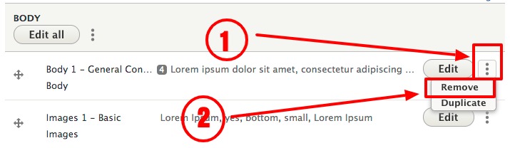
Removing a Section
To permanently remove a section from a page:
- Select the vertical ellipsis to the right of the Edit button at the top-right of your section, select Remove
View ScreenshotSelect the vertical ellipsis to the right of the Edit button at the top-right of your section, select Remove - Select Save at the bottom left of the form