Menus/Site Navigation
Menu/Navigation
Introduction
Your site’s menu/navigation is the practical representation of your site’s organization – also called Information Architecture.
Before you build your site menu/navigation, be sure to take a step back and look at your site organization with fresh eyes. See Organizing Your Site for information on organizing your site to best meet the needs of your users.
What's New in KU CMS - Sunflower
The new KU CMS – Sunflower menu/navigation system provides a dramatically different user experience from the previous CMS.
- New menu/navigation prioritizes the mobile experience
- Allows users to visualize and explore the site without leaving the menu
- Allows users to see their options first and make choices more efficiently
- Presents an opportunity to lead users through strategic pathways on the site. See Journey Mapping 101 (Nielsen Norman Group).
- Site organization strategies should be tightly coupled with the menu/navigation
- Only works well when things are in the menu and nested strategically to meet user needs.
How the Primary Navigation Works
The primary navigation consists of a top-level menu and sub-menus. These menus are displayed as panels with header and body sections, each providing links to uncover additional sub-menus or individual pages.
The new menu design relies on the nesting that occurs in a typical menu structure. All sites will have a top-level menu with topics that describe areas of the organization at the highest level, or in the most general terms.
For example, a top-level menu may have a topic labeled “Academics”. The “Academics” topic may be further described by topics such as “Degree Programs” or “Study Abroad”. Each of those topics—“Degree Programs”, for example—may be further described by “Majors”, followed by content describing individual majors. Consider the following diagram to better understand this nested relationship:
Nested Menus
- Creating the parent-child relationship between pieces of content is critical to helping your users find information quickly.
- Each click on parent menu item reveals a smaller set of items to choose from, narrowing the search until the desired item (or page) is located.
- The nested relationship between topics and pages is typically set during the content creation step. When a page is created or edited, contributors are presented with an option to add that piece of content to the menu.
- Provide the link text and select the parent menu item. In the case of the top-level menu, the parent will be the menu itself and should be labeled “Main Navigation”.
Nested Menu Example
- About
- Academics
- Degree programs
- Majors
- Major example no. 1
- Major example no. 2
- Major example no. 3
- Majors
- Study Abroad
- Degree programs
- Admission
- Research
- People
- Alumni & Friends
- Resources
Creating Menu Items
While creating or editing a page, locate the “Menu Settings” in the top right options menu. Before a menu link is added, that section will consist of a single checkbox labeled “Provide a menu link”. The form for adding a menu link has four fields:
- Menu link title
- Description
- Parent item
- Weight
Menu Link Titles
The menu link title is the text that appears in the menu. By default, Drupal will set the menu link title to use the page title. This text will appear in the menu (or sub-menu), as well as in the header. The menu link title will be used for the “GO TO” link text on all displays. On a mobile device this text will also be used for the link to previous menu panels.
- To specify your own menu link title, simply replace the default value.
- You can use any text you choose, but keep in mind how the text will be used. It is generally advisable to change replace the default value with a shorter, more succinct link title.
- Long titles may not look as good in the space provided by the navigation design.
- Titles that are longer than the space provided will wrap and may not be aesthetically pleasing.
- See Links for information, including guidelines and best practices.
Parent Item Selection
Top-level menu items will use the parent item labeled “<Main navigation>”. All other menu items should be placed under one of the top-level items, or under one of menu items in a sub-menu.
Menu Item Description, Weight/Drag Order
The menu item description is helpful and provides a tool-tip when users hover with a mouse. This field is not required but is recommended. Much like the menu link title, keep the description short and as descriptive as possible.
Menu item weight determines the order in which menu items are listed. Weight is an integer value and lower numbers are listed before higher numbers. While it is possible to order menu items using the weight values, it’s much easier to drag order items using the menu administration interface. Site administrators can arrange menu items by dragging individual items, or items grouped under a parent item.
Considerations for Parent Menu Items
- Parent menu items are those items used to group one or more child menu items.
- Keep in mind that a child menu item can also be a parent.
- Any menu item with children is a parent item.
- Selecting a parent menu item opens a new menu panel containing the children (sub-menu) of that item.
- Even if the parent item is, itself, a link to a page, selecting that item in the top-level menu or one of its sub-menus will open a new panel, (or refresh the panel, if it’s already open.)
- To visit the page linked to a parent menu item, select the item to open the sub-menu and select the “GO TO” link in the panel header.
- If the text in the menu panel header is not a link (and the “GO TO” label is missing) there is no page associated with that menu item. In this case, the menu item is referred to as a no-link menu item.
No-Link Menu Items
It is possible to create menu items that are not related to a page or other content on the site. These are referred to as no-link menu items. These items can only be added through the menu administration tools. A no-link menu item appears in the menu like other items and can serve as the parent menu item for subsequent menu items. The use of no-link menu items is an advanced strategy and should be used thoughtfully due to implications for search engine optimization and user experience.
Parent Menu Item Pages
Selecting a parent menu item will not take users directly to a page; rather than go to the linked page, a new menu panel will open. How then do users reach the page linked to the parent menu item? There are two ways users will reach a parent menu item’s linked page:
- The GO TO link, in the menu panel header
- Via search engine
Most Pages Should Be in Site Menu
The majority of your pages should be findable in the site menu. All pages that contain important information for your primary audiences belong in the menu. Unless you have a strategic reason, put the pages on your site into the menu.
Why? Users seek information in different ways. Some use the site search. Some start on the homepage and move organically from there. Some use the site menu to find what they are looking for. Make it easy on users to find what they are looking for regardless of how they prefer to use the site.
If your pages are not in the menu, you remove a primary method of information seeking and increase the likelihood those pages will not be found by some users.
There are some instances where pages can/should remain outside of the site menu system.
Examples of Pages That Can Site Outside the Menu:
- End of the trail pages - These pages typically contain information about a single topic, but have too much information to be included on a primary page.
- Temporary One-off pages - Special pages for temporary topics
- Special landing pages - These pages are often marketing pages designed to deliver users from paid advertising to a special landing page rather than start users on the site homepage.
Menu Panels and Headers
Each menu panel consists of a header and a list of links. (The first panel is an exception. It holds the navigation search tool, a list of links and the “Info For” menus.) The menu display is slightly different on a desktop or laptop, compared to a mobile device, i.e. tablets or phones. On a desktop or laptop menus and sub-menus are positioned in a row, with sub-menu panels positioned to the right of the previous, higher-level panel. On smaller displays, the panels overlap. On mobile devices, panels are stacked, displaying only one panel—the last panel to be accessed.
Headers
On a desktop or laptop, the menu panel header consists of a single link, labeled GO TO. This link serves as both the topic text that describes the list of links in the sub-menu below it, and the menu link for the linked page. Selecting this link in the menu panel header will take users to the page associated with that link.
In the case of no-link menu items, (menu items not associated with an existing piece of content,) the header will display the link text but will not show the GO TO label. These are not links at all, but serve only as a description of the sub-menu displayed in the panel below the header.
Mobile Headers
Mobile devices display menu panels differently due to the nature of a mobile display, specifically display size. On a mobile device, only one panel is visible. To navigate backwards through the menu structure, mobile menu panel headers provide two additional links: a link to the previous panel and a link that allows users to return to the top-level menu, where the search tool is located.
The first of these two links is located in the top left corner of the mobile panel header. The link text describes the previous menu topic. For example, using the “Academics” menu example, if you navigate to the “Majors” sub-menu (Academics -> Majors), the link back to the academics sub-menu would be “ACADEMICS”. If the previous menu is the top-level menu, the link text will be “START”.
The second of the two mobile panel header links is located opposite the previous link, in the top right corner of the panel header. This link is a small spyglass search icon. This link is used to return quickly to the first panel, where the top-level menu and the search tool are located. Selecting this link will close any open menu panels and place the cursor inside the search input.
Overlapping Menu Panels
Menu panels will overlap on smaller desktop and laptop displays, partially covering previous menus. As is the case with larger desktop displays, there is no link to show previous panels. That feature is only found on mobile displays. However, there is a special case for accessing the partially-hidden menus in overlapping displays. Links on partially-hidden displays are disabled. Selecting any part of the exposed portion of a partially-hidden menu will close any menu panels covering it or its sub-menu panels, revealing the menu and enabling the linked menu items on that panel.
GO TO Links
Starting at the second menu level, menu panels consist of a header section and a list of links. If a parent menu item is linked to a page, the GO TO link (in the menu panel header) will take users directly to that page. The presence of the GO TO label and the red icon at the end of the link are meant to emphasize the link to that page. However, users may overlook these affordances and focus on the menu items below. As a result, these pages (linked to the parent menu items) may be missed.
If these pages are somewhat hidden, why create a page here at all? Why not use a no-link menu item? The answer has to do with the other way users may reach pages on your site: search engines.
Parent Menu Item Pages
Parent Menu Item Pages and Search Engines
A significant portion of your site’s web traffic will come from online searches, also called "organic searches." If you use a no-link menu item, there is no page associated with that topic. There may be child menu items with pages of their own, but that might not be enough for users to find your site. Using the “Academics” example, consider the following scenario.
If you have a link titled "Academics" with no page, it’s just that—a link. A search engine will follow links, but that link will not lead anywhere. Related content (children of the no-link parent) with their own linked pages are likely to be found by search engines. The child pages “Degree Programs” and “Study Abroad” may be found by users searching with those terms, but what if a user searches for “Academics”?
Rather than use no-link menu items, create a page for “Academics” and add it to the menu. Now there is a page for search engines to find. So, when users search for the term “Academics”, they’re more likely to find your site.
What to Include on a Parent Menu Item Page
In the previous sections we discussed how users are more likely to find your site if you create a page for parent menu items, but we also suggested those pages could be overlooked using the site navigation. In short, you need a page but you can’t guarantee users will find it.
Going back to the “Academics” example, consider the following menu structure:
- Academics
- Degree Programs
- Majors
- Major example no. 1
- …
- Minors
- Minor example no. 1
- …
- Majors
- Study Abroad
- Degree Programs
In this example, “Degree Programs” is a parent menu item. The page for this menu item should reflect its relationship with the pages below it. The page could simply be a list of the types of degree programs, linked to their pages, (e.g. a link to the “Majors” page and a link to the “Minors” page.)
Keep it simple when creating pages for parent menu items. Remember, users may not find this page. Any content on this page may be overlooked. Try not to include important content that can only be found on this page. The list of links to child menu items can be included because users can discover those links through the navigation. If the user clicked on this parent menu item, they’re already looking at the links in the sub-menu displayed in the newly-opened menu panel.
Creating Content with Navigation in Mind
- Like any hierarchical index, your site should be organized from the broadest terms down to more specific, as users dig deeper.
- The hierarchical view of your site allows users to explore the site and make a choice based on the menu, rather than bouncing from page to page.
- The navigation provides a breadcrumb-style trail, to help users visually track where they are in the context of the site. After landing on a page, open the navigation to see the current page and the trail of pages leading there.
- To make the most of the features of the new menu design, your content has to be included in the menu.
Pages Not in the Menu
- Typically, content should fit within one of the categories created by the top-level menu topics, or in the categories created by sub-menus of those items.
- There are use cases where a page is truly the end of a journey and does not belong in the menu. However, anytime you have a page that does not fit in the menu, consider the audience for that content and evaluate:
- If the content is needed
- If the content should be incorporated into a page that is in the menu
- If the content should be delivered via alternate methods, such as social media.
Secondary Menu - Info for Block
In addition to the primary menu, there is a secondary menu that is displayed in the lower left of the main menu panel. By default, this block is titled Info for and is configured to add an additional audience-based secondary menu to your site. However, the block is fully configurable to meet your site’s needs.
How To’s
Add/Remove Links
The first link is required. Use the Add link and Remove link buttons to add/remove links after the first required link. Or, simply remove the information in the title and URL field and Save block to remove links.
Reorder Links
To reorder links, drag them to a new order position using the arrow cross icon to the left of each link field set.
Remove the Block
To remove the Info for block and link list from your navigation menu:
- Go to Structure > Block Layout
- Locate the Info for block in the KU Navigator Info region
- Select Configure
- Select the Pages tab
- Leave the Pages field blank and select Show for the listed pages
- Save
If the Pages field is left blank without any specific page paths, the block will not appear on any pages. Using this method instead of deleting the block entirely, allows you to add the block back in the future.
Change the Block Title
- Open the site menu panel
- Hover over the Info for block to reveal the Edit icon and dotted border
- Select the Edit icon
- Select Configure block
- Update the Title field
- Save block
Moving Beyond the 3-Click Rule
- The 3-click rule was a common concept in web design in the past. Modern research tells us, success should not be measured in a specific number of clicks, but whether or not users are efficiently and effectively finding what they are seeking.
- As long as users are making progress it is reassuring and is allowing them to efficiently find what they are looking for.
- Successful navigation builds good will and trust that other paths will also result in value.
- This style of menu allows users to explore the site and make a choice based on the options in the menu, without having to bounce from page to page.
Main Menu Requirements for Academic Sites
Academic unit and department sites (i.e., school- and department-level sites that award degrees) are required to provide degree and application information in one of the following two structure options at level-one of your main menu:
- Option 1:
- Academics
- Admissions
- Option 2:
- Undergraduate
- Graduate
Option 1: Academics / Admissions
In this structure, we recommend thinking of “Academics” as the place where users learn about degrees to determine if the program is right for them. “Admissions” can then be thought of as the place on the site where users can take specific actions when they are ready to apply. See “Option One – Sample Structure” below for a detailed look at the pages included and topics commonly covered in this menu structure.
Option 2: Undergraduate / Graduate
In this structure, the degrees are presented individually and by audience. Each degree section contains both the degree information and the actions users can take when they are ready to apply. See “Option Two – Sample Structure” below for a detailed look at the pages included and topics commonly covered in this menu structure.
Option 1 – Sample Structure
- Academics (learn about the degree)
- Areas of Study
- Majors/Minors
- Degrees
- Degree One
- The number of child pages parented to each degree will vary by program and context. Whether you choose to use a page or a section on a page for a given topic, be sure to use Headers properly to ensure the searchability of your degree information. Common topics include:
- Overview
- Prerequisites
- Careers
- Curriculum/Coursework
- FAQ
- Link to apply
- The number of child pages parented to each degree will vary by program and context. Whether you choose to use a page or a section on a page for a given topic, be sure to use Headers properly to ensure the searchability of your degree information. Common topics include:
- Degree Two
- The number of child pages parented to each degree will vary by program and context. Whether you choose to use a page or a section on a page for a given topic, be sure to use Headers properly to ensure the searchability of your degree information. Common topics include:
- Overview
- Prerequisites
- Careers
- Curriculum/Coursework
- FAQ
- Link to apply
- The number of child pages parented to each degree will vary by program and context. Whether you choose to use a page or a section on a page for a given topic, be sure to use Headers properly to ensure the searchability of your degree information. Common topics include:
- Degree One
- Advising
- Policies
- Link to apply
- Admissions (specific actions when ready to apply)
- The number of child pages parented to “Admissions” will vary by program and context. Whether you choose to use a page or a section on a page for a given topic, be sure to use Headers properly to ensure the searchability of your degree information. Common topics include:
- Apply
- Admission requirements
- Financial Aid and Scholarships
- Admissions FAQ
- Link out to appropriate KU admissions site
- Link out to cost and financial aid sites
- The number of child pages parented to “Admissions” will vary by program and context. Whether you choose to use a page or a section on a page for a given topic, be sure to use Headers properly to ensure the searchability of your degree information. Common topics include:
Option 2 – Sample Structure
- Undergraduate
- Areas of Study (for undergraduate)
- Majors/Minors (for undergraduate)
- Degrees (for undergraduate)
- Degree One
- The number of child pages parented to each degree will vary by program and context. Whether you choose to use a page or a section on a page for a given topic, be sure to use Headers properly to ensure the searchability of your degree information. Common topics include:
- Overview
- Prerequisites
- Careers
- Curriculum/Coursework
- FAQ
- Advising
- Policies
- Apply
- Admission requirements
- Financial Aid and Scholarships
- Prerequisites
- Admissions FAQ
- Link out to appropriate KU admissions site
- Link out to cost and financial aid sites
- The number of child pages parented to each degree will vary by program and context. Whether you choose to use a page or a section on a page for a given topic, be sure to use Headers properly to ensure the searchability of your degree information. Common topics include:
- Degree Two
- The number of child pages parented to each degree will vary by program and context. Whether you choose to use a page or a section on a page for a given topic, be sure to use Headers properly to ensure the searchability of your degree information. Common topics include:
- Overview
- Prerequisites
- Careers
- Curriculum/Coursework
- FAQ
- Advising
- Policies
- Apply
- Admission requirements
- Financial Aid and Scholarships
- Prerequisites
- Admissions FAQ
- Link out to appropriate KU admissions site
- Link out to cost and financial aid sites
- The number of child pages parented to each degree will vary by program and context. Whether you choose to use a page or a section on a page for a given topic, be sure to use Headers properly to ensure the searchability of your degree information. Common topics include:
- Degree One
- Graduate
- Areas of Study (for graduate)
- Majors/Minors (for graduate)
- Degrees (for graduate)
- Degree One
- The number of child pages parented to each degree will vary by program and context. Whether you choose to use a page or a section on a page for a given topic, be sure to use Headers properly to ensure the searchability of your degree information. Common topics include:
- Overview
- Prerequisites
- Careers
- Curriculum/Coursework
- FAQ
- Advising
- Policies
- Apply
- Admission requirements
- Financial Aid and Scholarships
- Prerequisites
- Admissions FAQ
- Link out to appropriate KU admissions site
- Link out to cost and financial aid sites
- The number of child pages parented to each degree will vary by program and context. Whether you choose to use a page or a section on a page for a given topic, be sure to use Headers properly to ensure the searchability of your degree information. Common topics include:
- Degree Two
- The number of child pages parented to each degree will vary by program and context. Whether you choose to use a page or a section on a page for a given topic, be sure to use Headers properly to ensure the searchability of your degree information. Common topics include:
- Overview
- Prerequisites
- Careers
- Curriculum/Coursework
- FAQ
- Advising
- Policies
- Apply
- Admission requirements
- Financial Aid and Scholarships
- Prerequisites
- Admissions FAQ
- Link out to appropriate KU admissions site
- Link out to cost and financial aid sites
- The number of child pages parented to each degree will vary by program and context. Whether you choose to use a page or a section on a page for a given topic, be sure to use Headers properly to ensure the searchability of your degree information. Common topics include:
- Degree One
Academic Unit Site Menu Structure
See "Main Menu Requirements for Academic Sites" above for a second option for degree and application information.
The recommended site structure for academic unit/department sites is as follows:
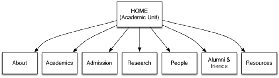
Home
- Concisely explain what your unit/department/program does
- Create a good first impression
- Focus on your primary audience(s)
- Get users where they want to go quickly and easily
- Provide answers to your primary audience's top questions
- Do you have my program/degree?
- Can I get in?
- What is the cost?
- Can I get a good job?
- Will I fit in?
- Illustrate your excellence and why you stand out
About
Create sub-pages within the About section:
- News
- Events
- Contact
- Giving
Academics
- Areas of Study
- Majors/Minors
- Degrees
- Courses
- Careers
- Pre-Requisites
- Advising
- Policies
Admission
- How to Apply
- Admission requirements
- Link out to the appropriate KU admissions site
- Link out to cost and financial aid sites
Research
- Highlight research
- Provide brief descriptions and links to any applicable centers or institutes
People
- Add person profiles for administrators, faculty, staff
Alumni
- Use this sub-section as needed
- Content might include: Alumni success stories, Newsletters, Giving, Donor list, Reunions, Keep in touch
Resources
- The Research section could be used to provide links to commonly used forms, documents, policies, or pages
- The section might also be used to provide information on any free or for-pay services or clinics you offer to the public or the KU community
Non-Academic Site Menu Structure
Site menu structure for non-academic unit sites is more flexible than for academic unit sites because the purpose varies. The following four sections are encouraged:
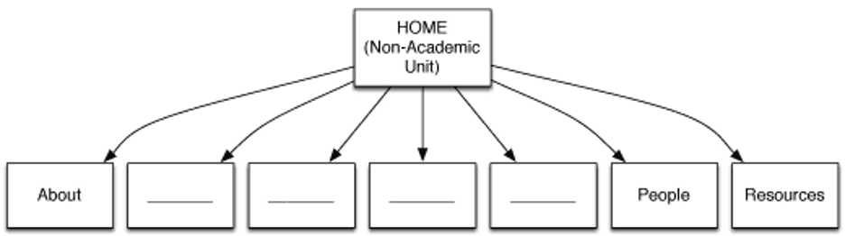
Home
- Concisely explain what your site is
- Create a good first impression
- Get people where they want to go as quickly and easily
- Provide answers to your primary audience's top questions
- Illustrate your excellence and why you stand out
About
Create sub-pages within the About section:
- News
- Events
- Mission
- History
- Contact
People
- Add person profiles for administrators, staff
Resources
- The Research section could be used to provide links to commonly used forms, documents, policies, or pages
- The section might also be used to provide information on any free or for-pay services or clinics you offer to the public or the KU community